New Look Poll

What do you think of the new forum look/feel?

  • OVERALL: I Approve

    Votes: 59 83.1%
  • OVERALL: I Disapprove

    Votes: 0 0.0%
  • OVERALL: I don't care about it either way

    Votes: 8 11.3%
  • NEW LOGO: I love it

    Votes: 36 50.7%
  • NEW LOGO: I hate it

    Votes: 3 4.2%
  • NEW LOGO: I don't care about it either way

    Votes: 14 19.7%
  • LIGHT/DARK MODE: I prefer Dark Mode

    Votes: 34 47.9%
  • LIGHT/DARK MODE: I prefer Light Mode

    Votes: 13 18.3%
  • LIGHT/DARK MODE: I don't care about it either way

    Votes: 6 8.5%

  • Total voters
    71

ZippityDooDah

Gonkulator
Staff Member
Joined
Aug 1, 2023
Posts
603
Like Points
3,382
From
Montréal, Québec
I'm curious to see what everyone thinks about the updated look around here. Now that I've had a little time to spend behind the scenes applying some updates and fixing some minor bugs and issues I wanted to do a little refresh including paying a designer to come up with a better logo than the free logo maker site I originally used lol.

Because the forum software doesn't allow separate multi-question polls in a single post I'm making the responses multiple-choice to best gauge what everyone thinks, which means you could technically choose that you both like and don't like something but please don't be that person! 😇

If you have any thoughts/suggestions on any of the forum looks or functionality, please share those thoughts in the Suggestion forum! I'm especially interested to hear what people think of the color scheme in dark mode since I found the new Xenforo default dark mode colors to be a little difficult to read certain text and such.

Finally, if for some reason you're asking "What new look?" you may need to do a "hard" refresh (CTRL+F5 on Windows, CMD+OPTION+R on MacOS, pull down swipe & release on mobile, or just clearing the cache and cookies for glp1forum.com).
 
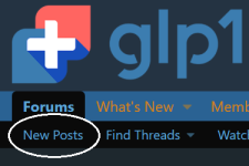
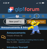
Was the removal of the “New Posts” button part of this refresh or a separate decision?
 
Was the removal of the “New Posts” button part of this refresh or a separate decision?
You mean this New Posts button?

1748376822633.png
 
Squinting ones
Weirdly enough I like the forum on light mode, but the rest of my phone on dark mode. I think I'm just used to it at this point.

@ZippityDooDah The *only* change I don't like is the default picture for new users. I preferred the letters because it made it easier to follow conversations, even if it was just different letters. There's so many people who just never change it. But I'll get used to it. 🤷‍♀️
 
@ZippityDooDah The *only* change I don't like is the default picture for new users. I preferred the letters because it made it easier to follow conversations, even if it was just different letters. There's so many people who just never change it. But I'll get used to it. 🤷‍♀️
I did that for two reasons, 1. so maybe people actually set an avatar lol, and 2. I found all the random colors of the generic avatars to be distracting and made pages look too busy for my taste, especially in dark mode which everybody knows is the best.
 
Weirdly enough I like the forum on light mode, but the rest of my phone on dark mode. I think I'm just used to it at this point.

@ZippityDooDah The *only* change I don't like is the default picture for new users. I preferred the letters because it made it easier to follow conversations, even if it was just different letters. There's so many people who just never change it. But I'll get used to it. 🤷‍♀️
I do like the way @indolent seems to be taking a well deserved break from his lab work

1748384335510.png
1748384403603.png
 
Am I missing the back button?
It’s entirely possible.. but I only see up and down arrows..
The back button had to be removed because it was obstructing the light/dark mode selection button on mobile devices and was coded in such a way that relocating it wasn't worth the effort, and everybody wants dark mode. I did turn the vertical scroll buttons back on because someone requested it and they're not really in the way of anything but they're badly coded and can be buggy so I'll probably whack them again at some point.

Are you using some ancient device that doesn't support gestures like swiping left to go back/swiping right to go forward?
 
I did that for two reasons, 1. so maybe people actually set an avatar lol, and 2. I found all the random colors of the generic avatars to be distracting and made pages look too busy for my taste, especially in dark mode which everybody knows is the best.
This update is brilliant! Huge props to the admin!

  1. Replacing the default letter avatars with an image? Genius move! Honestly, without this change, I'd probably never get around to setting an avatar. It looks so much cleaner now. No more distracting rainbow of letters cluttering up the page!
  2. Full Dark Mode support? 100% YES! This is how a modern forum should look. I'm absolutely thrilled that proper dark mode is finally here. Sites and apps that ignore dark mode are seriously painful to use – they practically burn your eyes after a while. Major kudos to the admin for getting it right. Dark Mode FTW!
 
The back button had to be removed because it was obstructing the light/dark mode selection button on mobile devices and was coded in such a way that relocating it wasn't worth the effort, and everybody wants dark mode. I did turn the vertical scroll buttons back on because someone requested it and they're not really in the way of anything but they're badly coded and can be buggy so I'll probably whack them again at some point.

Are you using some ancient device that doesn't support gestures like swiping left to go back/swiping right to go forward?
On the iPad you can turn websites into apps, like I do with this site. Sadly, you cannot use this feature because I can't go back.
 
On the iPad you can turn websites into apps, like I do with this site. Sadly, you cannot use this feature because I can't go back.
You can do this on android too and the swipe to go back function still works. iPad should have the same functionality. Have you checked your gestures settings?
 
On the iPad you can turn websites into apps, like I do with this site. Sadly, you cannot use this feature because I can't go back.
The forum software includes PWA (Progressive Web App) functionality which basically does the same thing by installing a shortcut but also adds additional functions like push notifications, etc. and swipe gestures work just fine on all my iDevices whether I'm using the PWA app or just in Safari or even Chrome.

You can do this on android too and the swipe to go back function still works. iPad should have the same functionality. Have you checked your gestures settings?
I'm with you, I think this is either a configuration or user confusion issue. I hated gestures originally, but I eventually adapted and haven't looked back.
 
The back button had to be removed because it was obstructing the light/dark mode selection button on mobile devices and was coded in such a way that relocating it wasn't worth the effort, and everybody wants dark mode. I did turn the vertical scroll buttons back on because someone requested it and they're not really in the way of anything but they're badly coded and can be buggy so I'll probably whack them again at some point.

Are you using some ancient device that doesn't support gestures like swiping left to go back/swiping right to go forward?
Yes- me.
An ancient human using an iPhone 14 Pro.
But thanks to your post, I can figure it out.
Or live without it. Doesn’t seem to be working. 🫤
 
Yes- me.
An ancient human using an iPhone 14 Pro.
But thanks to your post, I can figure it out.
Or live without it. Doesn’t seem to be working. 🫤
I keep an old iPhone 12 pro max around as a backup and gestures work perfectly on that. I linked a "how to use gestures" YouTube video in the New Look Poll thread that might help.
 

Trending Topics

Latest Posts

Forum Statistics

Threads
3,307
Posts
54,544
Members
7,152
Latest member
Rockaroo
Top Bottom